
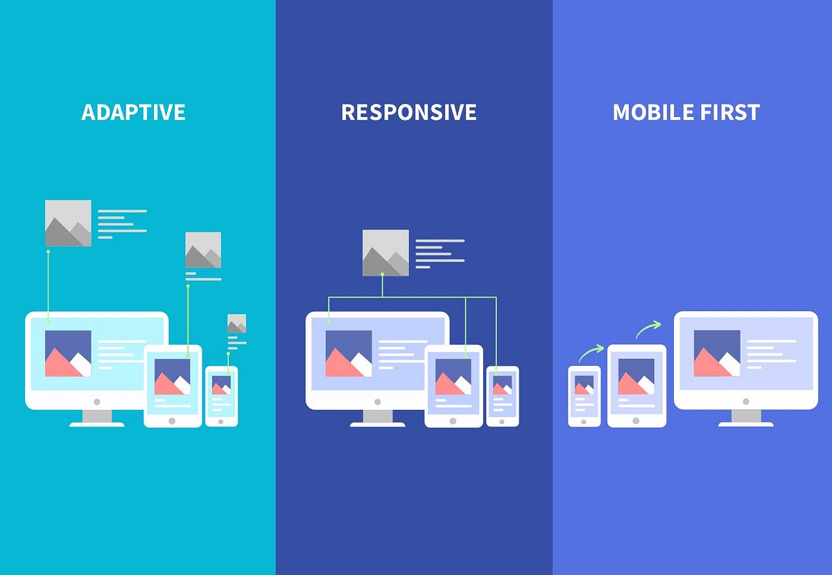
In today’s digital world, users are no longer confined to desktops. With smartphones dominating internet usage, businesses must rethink how they design and develop websites. A website that works perfectly on a desktop but fails on mobile is no longer acceptable.
This is where Mobile-First & Responsive Design comes into play. It ensures that your website delivers a seamless experience across all devices, whether it’s a desktop, tablet, or smartphone.
In 2026, having a responsive website is not just a design choice; it’s a business necessity. In this comprehensive guide, you’ll learn everything about mobile-first design, responsive development, benefits, strategies, and how to implement it effectively.
Mobile-first design is an approach where developers start designing a website for smaller screens first (mobile devices) and then scale it up for larger screens like tablets and desktops.
Responsive Web Design (RWD) ensures that a website automatically adjusts its layout, images, and content based on the user’s screen size.
Result:
One website, multiple device compatibility.
More than 70% of users access websites via mobile devices. Ignoring mobile users means losing a major chunk of your audience.
Search engines prioritize mobile-friendly websites. Mobile-first indexing means your mobile version determines your ranking.
Mobile-first websites are optimized for speed, which improves user experience and reduces bounce rates.
A seamless experience leads to better engagement and higher conversions.
Responsive design ensures users don’t struggle with zooming, scrolling, or navigation issues.
Focus on essential content and features. Avoid clutter.
Display the most important information first.
Users should feel familiar whether they use mobile or desktop.
Design the layout for smaller screens first.
Use percentage-based layouts instead of fixed widths.
Adjust design based on screen size using CSS.
Use responsive images that adapt to screen resolution.
Check performance on mobile, tablet, and desktop.
Intrusive pop-ups harm user experience on mobile.
Buttons, forms, and images should adapt to screen sizes.
Ignoring mobile performance
Using heavy images
Poor navigation design
Not testing across devices
Overloading content
The future of web design will focus on:
Mobile-first design is an approach where websites are designed for mobile devices first and then adapted for larger screens.
Responsive design ensures a website works smoothly across all devices, improving user experience and SEO.
Yes, search engines prioritize mobile-friendly websites due to mobile-first indexing.
Yes, responsive design allows a single website to function seamlessly on both desktop and mobile devices.
Tools like CSS media queries, frameworks (Bootstrap), and testing tools help create responsive websites.